Showing posts with label animation. Show all posts

Sunday, February 7, 2010

Covers and posters - an analysis

So after my last post, Adam aka. NitWitt from AblinoBlackSheep and I got into a discussion about how different companies handle DVD covers and poster designs. It couldn't be helped with the three-in-a-row assault of bad DVD covers.

What follows is a case study of promotional cleverness vs. redardation.

HOW TO MAKE PEOPLE WANT TO SEE YOUR MOVIE


What I like about this picture:

  • It has good composition. It is impossible for your eye to get lost, it can only travel in one direction.
  • There are no unnecessary characters. You have to squint to see the bird and we aren't treated to any of the unimportant characters.
  • It leads us to ask questions about the film. "Why is there a flying house, what's the deal with this old man and kid? I'm intrigued."
  • It's a candid snapshot. They are captured in a moment in time. They don't know you're there.
COMPARISON


Wait, what is this movie about??

The characters haven't been photographed by an unseen photographer like in the Up poster. They were there for a photo shoot. A publicity photo shoot.
It's just a triangle of the main characters. And why is Scrat there?
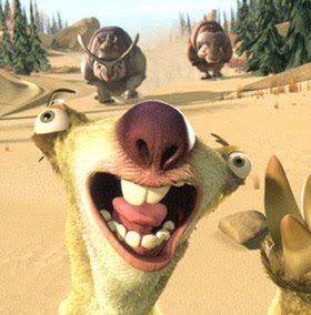
On a slightly unrelated note, the concept design of that sloth or whatever the fuck he is should have probably gotten to a second or third draft before they settled on this.


A ROBOT STORY I'D LIKE TO SEE


Like many Pixar films, Australia saw the totally unremarkable videogame adaptation of this title arrive on our shores long before the actual movie. Thankfully I didn't play it, but the cover (which is the same picture they used for the film posters) made me want to see the film.

"Hm. That robot looks really lonely. Looks like he's the only robot left on the planet. But hey! There's a robot there in the background that he doesn't even seem to notice. What is that thing?"

It's a totally uncluttered design that drops in a few points of focus: Wall-E, the ship, and Eva. That's it.

THE ROBOT MOVIE THAT PUT ME OFF WANTING TO LEARN MAYA FOR THREE WHOLE YEARS


So wait a minute, why is the corporate asshole bad guy standing next to all the goodies? Oh yeah. Because this is a publicity photo shoot that has nothing whatsoever to do with the plot of the movie.
It's sheerly and solely an attempt to sell the characters. To remind the kids which happy meal they are supposed to buy. Which is kind of ironic when you think about it, because these characters are ugly as sin.

LET PEOPLE KNOW WHAT THE FUCK THE MOVIE IS ABOUT!!


The top two thirds of this picture are consumed by the two most important characters. The rest of the cast are delegated to where they belong. Woody looks both fearful and skeptical, and Buzz really believes he is a flying superhero. You've summed up everything you need to know in one clean snapshot.

AND EVEN FROM DISNEY...


Umm. Okay.

So, uh...

Well, at least they're not looking at the camera. But still, I guess it's about a bunch of... animals escaping in a minecart from. A pair of...

...ghost... cowboys??

LET'S COMPARE SOME AQUATIC ANIMATIONS


Cluttered? Maybe. But you will note that our main characters are still immediately visible as the colourful dots in the middle. Good placement and colourscheme still give them the spotlight, despite their utterly insignificant size, which emphasises their vulnerability. Their vulnerability in an entire ocean full of snarling, dangerous creatures. Even when Pixar do it wrong, they do it right.

VERSUS...


It's generally agreed that this movie is pure scum, and everything about it is a perfect example of what not to do in a movie. But this cover somehow manages to make it even worse.
It's another one of these dull, cluttered, busy, pointless photoshoots where they have tried to fill every ounce of space they can with a sellable character. They've even managed to squeeze in the rasta jellyfish on the side! They didn't even DO anything! And good god. Get a load of the Robert De Niro shark. There's a reason sharks don't flex their fin muscles, it's because it looks fucking wrong.

Hey, wait a minute.

WAIT.


Wow. WOW.

They must have been designed by the same guy on his lunch break. He must have REALLY been under the gun. I bet his initial design brief must have looked something like this.


ALRIGHT, BACK TO THE MAIN POINT


  • Narratively charged props (the knives) also act to draw the viewer's eye.
  • Bad pun that still gets the point across perfectly.
  • We know what this film is about. But we don't know enough. Makes me want to see it.
There really is nothing wrong with this picture. It says everything.

COMPARE.


So wait, are those things in the foreground the aliens? No wait, they must be monsters. I guess the aliens are the things in the weird ships.
So what's this movie about? It's just a bunch of monster things standing around looking at the viewer. Oh wait. I guess the movie is about monsters vs. aliens. Now there's a plot and a half.
And what is with that fishman on the right? Who died and made him the King of Cool? Maybe the Fonz. I dunno.


You get this face a lot, actually. I won't go into it but it's omnipresent, like a disease.


(The skunk annoys me the most, I think)

And while Ratatoille is still fresh on our minds, how many of you had difficulty pronouncing it the first time you saw it on a poster? I sure as hell know I did. Those wacky French. Oh, but wait! They've kindly guided us to the pronunciation underneath: "rat-a-too-ee". Oh wow, even a kid can manage that.

Obviously everyone must have had as much trouble pronouncing "Igor".


There are so many things wrong with this, I don't even know where to begin.
Apart from the film looking quite horrid in general (I have only seen the trailer, but this alone has alerted me to the terrifyingly bad animation and character design found within), have you ever met anyone retarded enough not to be able to pronounce Igor? Did they think everyone would be pronouncing it "Eye Gore"? The ultimate irony is that Igor is an Eastern European name that is actually pronounced Ih-Gor. Emphasis on the second syllable, not the first. Being a linguistics nerd helps sometimes.
Clearly, the only reason they snuck that bullshit in was because it would remind people of Ratatouille, a film actually worth seeing.

And this is kind of tangential, but why the fuck did they make him look so cute? It's a film about Igors, for fuck's sake. In Terry Pratchett's Discworld novels, the Igor clan is described as a slobbering pack of ugly, demented hunchbacks that live in the mountains. Frankly, I've never seen or heard of a typical "Igor" being described or portrayed in any other way.


But I'm sure if he looked like this, he wouldn't have sold quite as many lunch boxes.


It would be too challenging for the scriptwriter to invite the children to sympathise with him. Because kids are stupid and writing a good story with sympathetic characters is apparently really, REALLY hard.

They could have made Igor look like this.


He's ugly, but he's also cute. There is something very appealing and functional about this design, it's funny and I'm sure the kids would lap it up. If you want to go all soccer mum focus group on us, maybe give him some pupils. But make sure they poke in different directions like the Igor from Young Frankenstein and we're set.


ONE LAST NUGGET TO CHEW ON

Okay, I'm not a fan of Alvin and the Chipmunks. I've outgrown the original cartoons, and modernising them is not only wrong in a disrespectful way, but it's also wrong in a very real "viewing experience" way.
I think if I had to babysit some kids I'd rather snap the disc in half and tell the parents the kids did it by accident than actually watch it with them. Even if they were really well behaved kids and asked nicely.
But this cover isn't all bad.


PROS
  • The guy from "My Name Is Earl" doesn't take up too much of the frame. All we see of him is that he is the literal doormat of the chipmunks, and that he is distressed and confused.
  • The location sets the scene. Oh, okay. So it's a film about the chipmunks wreaking havoc.
  • Alvin's pose is interesting. He's like, shouting triumphantly. He looks pumped.
CONS
  • Alvin's brothers suffer the Fonz ailment. I guess they're 2 kool 4 skool.
  • The angle is straight on. That's very lazy.
But what's this?? The Squeakquel poster looks suspicously familiar.


Copypasta, anyone? The one on the right is fucking identical, and the one on the left has only been tweaked enough for a corny otaku peace sign.
They also decided it would be 'cooler' not to give us any clue whatsoever what the film was about. Apparently the fact that it has the chipmunks looking smug in it is enough.

Somehow, they managed to actually remove everything that was good about the poster of the original.


Poster design 101, folks. I hope you learned something today.

Thursday, October 22, 2009

Lots of dead rabbits

Last night I watched two movies, though it was more like watching ten movies. They were Watership Down and Genius Party.

I will preface this post by saying that both of these movies are pretty fucked up. They are, however, fucked up in very different ways. For now, I will save Genius Party for a later post's discussion, where I will also discuss a few other assemblies of short films, which are popular in Japan at the moment but also are cropping up in the form of movies such as Fears of the Dark, a collection of French black-and-white animated shorts.

But for now, let's start with the British animation, Watership Down.


Okay seriously, where do I begin.

You could well be forgiven for hating this movie. Technically it's a masterpiece, but it is so confronting that audience alienation is at some point almost inevitable.
See the thing is, this movie looks deceptively cute. It's a story about a bunch of bunny rabbits. The backgrounds are rendered softly with watercolours, it has a quaint British feel, and has a large cast of rabbits full of personality.
That said and done, this is a terrifying film and it is not for children. I speak from experience because I saw it when I was very young (about five) and didn't see it again until last night. Nonetheless I have been having nightmares about particular scenes from the film to this day.


(Wondering what this is? It's a bunch of rabbits trying to get out of a burrow which is blocked by the dead bodies of other rabbits. Be sure to get a DVD for your kids today!)

The story (which is surprisingly complex and multi-layered for a seventies animated feature) tells of Hazel and his mad brother Fiver, who are sick of living in their warren with the other rabbits when suddenly Fiver has an omen of the hill nearby overflowing with blood. So we're off to a good start.
Before you know it, they round up a motley crew of other rabbits who wish to leave (the main thrust of the exodus being Fiver's terrible omen), and embark on a series of incredibly horrific adventures where they are hunted by virtually every form of predatory fauna in the United Kingdom, including west-country farmers.
Once they have braved the dangers of these predatory animals, they must contend with a sinister, almost faschist organisation of rabbits that they have stolen does from. These other rabbits are fucking viscious and probably scarier than any of the other animals in the film.


The movie was based on a book by Richard Adams, and I think it would be more palatable as a book than a movie for children. One of Anthony Burgess' complaints about the Stanley Kubrick adaptation of A Clockwork Orange was that unspeakable violence was a lot easier to digest in text than it was to view it on screen, and upon watching this movie I knew exactly what he meant.


So what exactly is good about this film? Well, in my humble opinion, just about everything.
While not superb to say, Disney standards, the animation in the film was quite good. There were no 'mistakes', and there was a vast amount of attention to detail to make the animals' movements naturalistic. Really the only thing bringing the animation down is a number of 'quickstarts' and 'quickstops' to the motion of the characters that may have benefited from some cushioning.
Anthropomorphism has been used to a minimum here, giving it a different feel to just about every other 'animal' animation I have watched.
The score was stirring and appropriate. The Art Garfunkle 'Bright Eyes' song should have felt out of place - indeed, that was my first thought - but I found myself fighting tears by the end of the song. The determination of Fiver is nothing short of tear jerking.


In terms of the story, it was bold and ballsy, and despite being quite 'in your face' with one disturbing catastrophe after another, I was glad to see a film from so long ago that had a story to tell and was determined to tell it no matter what. It's sure as hell not a film I'd be showing my children in a hurry, but ironically it is the epitome of what I would consider 'adult animation'. Not animations with lots of sex and gore and foul language, but an animation that was meant for grown men and women to enjoy.
Clearly, the investors (of which there were many) were very progressive thinkers in wishing to fund this project which was so wholeheartedly outside of the accepted animation norm back in 1978.
Apparently it made a killing, which goes to show that sometimes progressive animations can actually be successful.

We need more risk-taking. We need more "fuck you"s to the Disney model. I mean I like Disney movies as much as the next animation nut, but the stories are so weak, so boneless, so driven by formula. If you bitchslap them they will be in a wheelchair for life.
I'm not saying kids animation should be like Watership Down. Heavens no. But that doesn't mean animation plots shouldn't have a little more goddamn thought put into them.

Thursday, October 15, 2009

Learning to animate 'too late'?

http://jameslee.deviantart.com/art/TARBOY-134560109


Perhaps some of you saw this on deviantArt or NewGrounds lately.
Well, I saw it about two years ago. And I saw it again about ten times before it was uploaded *anywhere* on the web.

It's the brainchild of a fellow called James Lee who is currently helping me with my own final film, The Rise Of Kaiser Fate (working title).
I am prefacing this post with that link so that you know that both members of this party know their shit when it comes to Flash.

At the beginning of the year I made a solemn promise that I was going to make something better than Tarboy but thanks to good old laziness and procrastination, that won't be happening - at least not until next year.
That said, don't make the mistake of thinking that James Lee and I are rivals (though at first that's kind of what I wanted us to be for some reason). Rather, we are friends, and he is one of the only people in Australia (or anywhere for that matter) who I can talk to at my own level about Flash.

Which brings us to the point of this post.

Why can't I use this stupid program?! I couldn't learn how to use this confounded thing if I had a billion years!!!


Well incidentally, I bumped into James Lee at South Bank yesterday and we got talking about my film and, eventually, why I was behind in it. He wasn't actually aware that I was doing a fifty credit point semester - which means I'm doing one more subject than everyone else.
This led to me explaining how I had to do some monster compositions in a nodal compositing program called Shake. If you don't have someone to guide you and try to learn the program in a vacuum of isolation, getting anything done is not only impossible, it's actually infuriating. I recalled having the exact same problem with Maya while I was at QUT and said, "it helps me understand why so many people find Flash difficult."

See, James and I are both at a point where using Flash is not an obstacle. We don't spend 50% of our time animating trying to figure out how to do this or that little effect in the program or struggling with the timeline controls. We spend zero percent of our time doing that, in fact. This is because we have both been using the program for a very long time - in my case, about ten years. That's more than most of my lecturors who teach the program.
I lamented that so many people give up at the drop of a hat these days not realising how much work is actually involved learning the project. It was then that James Lee suddenly distilled the problem so clearly. It magically made sense.

He casually said, "Well see, when you're a kid, anything you make in Flash is cool. You're quite content to make stickmen run around the room and fight each other-" (which is precisely what I started off doing) "-and the sense of satisfaction is there. But if you're an artist who's just gotten into uni and you've never used the program before, everyone is biting off more than they can chew and they are frustrated that they cannot make animations that have taken other flash animators five years to get to the point of doing".

This is such a perfect way of explaining it. Why the hell would you naturally assume your first animation (or second, or third, or hundredth) will look like one of Adam Phillips' Brackenwood cartoons?
When I first started using Flash, it was version four (before it was popular or useful in any concievable way) and I got a huge rush from making the crappiest animations. What was my alternative? Flipbooks in my excercise books! By those standards, Flash 4 was a godsend! What were the greatest flash animations on the web at the time? Stickdeath. Does anyone remember that?
Not exactly a whole lot to compete with.
Just take a look at some of my earliest animations, the ones I made before I knew what NewGrounds existed:


While I was growing with Flash, so was the world of online animation around me.
Newer, better animations began to surface - more complex ones that I suddenly felt the need to catch up to. If I was going to be in this game, I had to play to win. Every time I saw an animation that blew me away, I'd save it to my hard drive (a lot easier in the olden days) and study the fuck out of it until I could figure out exactly how it was done.
Suddenly I had to step up to the plate and really push myself. Every single animation I made was slightly more advanced than the previous one.


Suddenly I was actually winning fans! Mid high school, I was getting literally hundreds of emails from fans congratulating me on giving them some really good entertainment and great animation. It's funny really because I look back at what they were talking about and frankly it looks like shit. But it was pretty good at the time, as the Flash community was still growing, and me with it. I kept trying new things and pushing the boundaries of Flash. Before you knew it I was nesting things inside each other about fourteen layers deep! I still find it rare to come across other animators who work like this and it came purely from me trying to stay in the forward ranks of the crowd.
Before you knew it, I was in university and more people knew me as "the Flash guy" than my real name. Suddenly I felt a pressure to perform unlike anything I'd experienced prior.


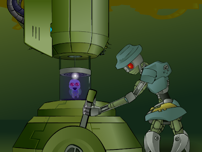
"Engineered" was thus made for a university assignment, and it was a first for me in many respects. It was the first five minute animation I ever made - the first animation where I had ever done such a quantity of work in less than half a year - the first time I shaded absolutely everything from beginning to end with gradients - and the first time I regularly drew characters and scenes from different angles instead of flatly reusing them from previous scenes. And even then it looks pretty flat to my eyes these days.
This Flash was also a breakthrough for me as it was the first time someone challenged me to do something well outside what I thought Flash was capable of and I was actually able to do it.
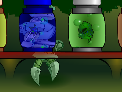
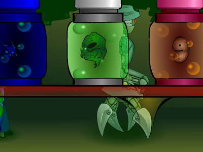
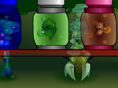
My Canadian friend Jay, a gentle giant of a man who deceptively looked like someone who beat up five year olds for fun, saw that I was working on a scene where the robot and the aliens walked behind liquid-filled glass jars preserving various alien foetuses.

"Hey, y'know what'd be cool? They should like, wrap around the jars as they go behind it. Like they warp and stretch through the glass as it refracts them."
I looked at him like he had an arm growing out of his neck.
"Jay, do you have any idea how long that would take? In any case I don't even think it's possible in Flash."
"Are you kidding, man? You can do anything in Flash, you're a fuckin' wizard! I bet you could come up with some clever way of doing it."
I nearly exploded. "Jay, don't do this to me, the film is due in like four weeks, and what you're suggesting can only be done with Frame By Frame. It would take ages, it'd look like shit and it would just be a waste of time. You can't do it with some special trick in Flash. The only thing I can even think of that might come close is if I were to go into the panning graphic, copy and paste the shape of the jars, use them as masks, mask out the robot and aliens... stretch an additional graphic from left to right... hang on, wait."
He laughed and went back to his own animation. When he came back to check up on me, I had beaten the challenge.


These stills don't really do it justice, but it became one of the most popular shots of the film, and everyone who saw it dropped their jaw with shock. It looked great, and I would never had done it if Jay hadn't made me.
Suddenly, I realised that Flash is nothing but problem solving.
There's nothing the program can't do. Only the animator.
This led to a veritable avalanche of future work that was a lot more dynamic than anything I had done previously, because I knew that I could handle any shot, no matter how complex, given enough time and patience. The challenge is figuring out how to do it.

From here on in, the one big thing that has improved with my animation is speed.

Did anyone see Ill Fate: Ep. 2?


This film contains many of my best shots ever and it also contains a lot of crap that was stretched to meet the deadline. That said, I think it's still a pretty big achievement to animate five and a half minutes of complete animation in as many days.

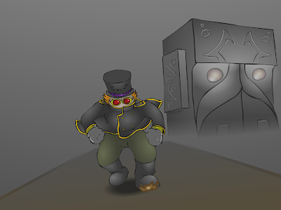
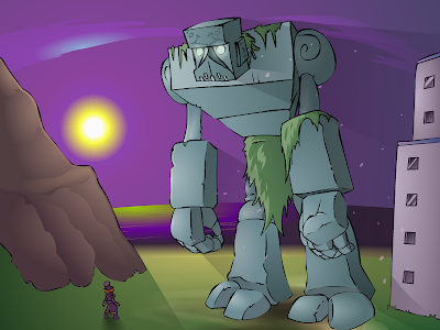
Lately I have discovered my big challenge is to mix it all with Frame By Frame. FBF is a lot harder (like, a LOT harder) and more time consuming (like, a LOT more time consuming) than tweening, but it looks more impressive, plain and simple. I have virtually made a career off tweening but I don't want to be known as the best tweener around, because that's like saying you are the best high-jump athlete at an aero club. There was a bit of pretty adventurous FBF in Ill Fate 2, particularly the Kaiser running up the Collossus' arm (top picture), but I endeavoured to include more FBF whenever I could from that point on. Usually, however, I still end up balancing the scales to tweens simply because of time restraints. If you can make them look good, then hey, you have just spent a tenth of the time and the effort. It just won't look as good.


These days I tend to go for a mix. For some reason, the marriage between tween dynamics and the raw beauty of frame by frame is totally underused. Well hey, all the more for me, because I think it's a quirky and pretty unique look. It's simultaneously taking advantages of the restraints of Flash and giving them the 'fuck you'.


THE POINT OF ALL THIS is that I didn't just wake up one morning able to use Flash. Same goes for drawing, I spent several years learning to do both.
If you want to make it sound hard and brutal, I have been using Flash for one decade and I have been drawing for two. Do the math.
Don't be disheartened if Flash is giving you the shits. Don't worry about your animation looking like it fell out of a tree.
It's all about practice, and that's all there is to it. The only difference between you and me is that I got a headstart.

Friday, September 11, 2009

Rock and Rule review

Recently, I asked a few of my friends to throw out some bad animated movies at me to review for my blog.
One of the more tentative requests came from my friend Meoshira from deviantArt, who seemed to think that the movie was weird rather than just plain bad.

After viewing it, I would be inclined to agree. Rock and Rule is not a bad movie, nor is it a fantastically good one, but certainly worth looking into if you have an interest in what has very broadly come to be known as "adult animation".


The film was released in 1983, and revolves around pop music.
This is already the most apt description of the movie that can be conveyed in one sentence. The very nature of pop music is such that if you base a work around it, that work will date very fast. And Rock and Rule is pretty dated.
If you're like me and have a fetish for retro - everything old-school and so past its use-by date it's turned from wine to vinegar - then you're in for a real treat. Otherwise you're going to find this movie very hard to sit through.
This applies to the whole movie, not just the music, though the music is by far the most dated feature of the film. Most of it seems to be by Cheap Trick, and while I have nothing against Cheap Trick they did always strike me as a twenty-years-too-late ripoff of The Beatles, which kind of double-dates it.
One thing I will tip my hat to them for with regards to the use of music is that, despite my fears, all music by pop-bands made for this movie were made specifically for the film, which is a breath of fresh air in this department. Comparatively speaking, Yellow Submarine used songs that The Beatles had described as songs they didn't really care about, because they didn't want to waste the good ones on what they predicted would be a bad film. The fact that these Canadian guys actually managed to get Lou Reed, Iggy Pop and a bunch of others to come into the studio and write songs for the movie is quite impressive.
That said, every one of them shrieks "the eighties, here and now". It's challenging, to say the least.
As I said, though, there are other parts of this movie that have not aged well.

First of all, this is one of the many creative works (comics suffered from this problem particularly badly) that came from the awkward period of time that no one knew what a furry was, but they were appearing anyway.
Nowadays, if you want to create a work full of anthros, you can be excused for going all-out. Back in the eighties, it wasn't very established, and so you had a lot of concern from directors over how "human" the characters should look. The problem here is that the characters in Rock and Rule don't look like anything.


(Can you spot Shaggy?)


The introduction of the movie states in plain English that after what is alluded to being World War Three, the only survivors of Earth were cats, rats and dogs, who all evolved into humanoid mutants. It doesn't hint that any other species survived.
The reason I take issue with this (the fact that one character looks like a pig notwithstanding) is that upon hearing this, I imagined three 'looks' for characters that would suggest cats, dogs and rats, respectively. Instead, it seems that in a display of utterly erroneous convergent evolution, these three species have somehow merged into a race of humans who have pointy ears and coloured bits on their noses.
I am frankly okay with this when it comes to characters like Stretch and Dizzy, who do kind of look like rats, but then you get characters like Angel and Omar, the leads, who just look like freaks. They are humans through and through - no tails or anything - and the only things distinguishing them as animals are that Omar has this ugly and very asthetically unpleasing snout jutting from where his nose should be (it looks like an adhesive) and Angel has these giant, slanted eyes that make her look like a grey alien. I'm still not sure whether either of them are meant to be cats, rats or dogs.


The coolest character design in the movie is that of Mok, who look suspiciously like Mick Jagger. He is cast perfectly by Don Francks and has the coolest and strongest personality of the film, and thus it is a crying shame that he suffers badly from that most evil of animation-killers: plot.
Mok basically wants to summon a demon. This is no secret, it's repeated throughout the film, on the back of the DVD cover, everything. The whole point of the movie is that he needs Angel's voice to summon it.
Unfortunately, it is NEVER revealed why.
He has this amazing setup for his personality - a decrepit rock star who is, in his own eyes, fading into obscurity (when this really means his last show had two empty seats). He is a paranoid, delusional magician with a dangerously fragile ego. And yet I don't know whether he's trying to summon this thing for revenge, fame, power...?
I hate it when writers ruin good characters with unclear motivations. It's like giving a chef the finest sirloin you can afford and he throws it into a pot of boiling water.

While we're on the subject of characters, I'd like to point out a good thing and a bad thing about the two main characters. The good thing is that Angel is a strong, capable character, not some damsel in distress (which STILL persist in animation to this day). She actually ends up being the hero of the movie, not Omar.
Which brings me to the bad thing. Omar is a dick. Like, he's a real dick. I hate him.


(Seriously. What a wanker.)


It has long been known that you can have a dick as the main character and the story can still be appealing. The one thing you will consistently notice, however, in the stories that work is that said character goes through some kind of moral and emotional development. They realise they have been a complete dick and make an effort to change. I'm thinking Woody from Toy Story.
With this in mind, I watched the film optomistically hoping that Omar would develop as a character, and he doesn't. When the credits rolled I still wanted to punch him.

As for the animation, it's brilliant. There were probably two instances where Omar's ugly snout thing rolled around his head the wrong way, and frankly I was expecting from the beginning for this to happen a lot more. That seems to happen a lot (I've even seen it in comics, so animation is a deathtrap here) when you take a character so human that they may well have been rotoscoped and slap on 'bits and pieces' that aren't there naturally. All it takes is one assistant animator who isn't paying attention and you'll get a horrible 'sliding face' glitch, but the movie is surprisingly devoid of this.
In all aspects, I found the animation of the characters to be quite good. There are obvious 'ping-pong' moments when some of the characters dance in the night club (Frames one-to-ten then back down to one again, rince and repeat), but that aside there are consistently beautifully fluid movements throughout the movie. It's actually a real treat to see a non-Disney movie this old that looks this good, because it's a damn rare find.

The special effects that the movie utilises are similarly very ahead of their time. This movie was made around the same time as Tron, and the CGI that it does contain (small in quantity though it may be) is actually better. Mostly, however, they relied on basic photographic special effects, and this has resulted in some stunning sequences.
I can't get enough of the multiplane in this movie, which has been used exquisitely. The shot of the car travelling from a God's Eye View through Ohmtown and our first view of the filthy Nuke York spring to mind immediately as visual treats.
One of the best looking moments of the film is the Lou Reed-composed song, "My Name Is Mok", which, while very eighties-looking, is executed very well.


(I admit it. Nuke York gave me chills, however lame the name was.)


All in all, I would call this a flawed masterpiece. There are some great things about this film, but not enough to save it from mediocrity, unfortunately. It was sad that this film nearly bankrupt the company that made it (worse animations have done better at the box office), but it wasn't without error and to me, to put on my script-writer's hat for a moment, it felt more like a first draft brought to completion. They did a fantastic job of realising a story that wasn't yet all the way there.

Wednesday, July 22, 2009

Masters of emotion

Today, I will be talking a lot about the technical side of animation and how it is used to achieve an emotional response from the audience, so I'll take off my potent Writer's Hat for now.

Gesture and body language are pivotal to relaying a thought or emotion. A lot of people forget this, and go straight for the face, the expressions and the eyes. There are really annoying phrases like "the eyes are the window to the soul" flying around that give many animators the wrong idea. I think they are just one more tool in the toolbox of a good animator. You can take facial acting and cocked eyebrows and half-smiles and all the rest of it, but you should never neglect the potency of a well animated gesture.

Have any of you seen The Hand? It's a film by Jiri Trnka, a brilliant Czech animator who made and used little marionettes for a number of beautiful stop motion films. The thing about Eastern Europeans who made films like these before the nineties is that they were in a very unique position of being able to sneak past the censors and make harrowing political commentaries in their films that harshly criticised the reign of the Soviet Union. This stuff really deserves a post of its own (don't get me started on Jan Svankmajer, we'll be here forever), but as far as The Hand is concerned, when I saw it what blew me away was how much emotion Trnka managed to get out of this little wooden puppet.


Sometimes a cigar is just a cigar, but watch the film and you will see what I mean about the political commentary. It's so obvious, but I think the censors regarded animated stuff as 'kiddie shit' or something because animators were amongst some of the only people in the Soviet states who could get away with criticising the government without getting a pick-axe buried in their skull. So in a way, Walt Disney saved lives. But I digress... Seriously, we will come back to this at a later date because it really is amazing.


The design of the puppet is exquisite. He's simple, funny, and a mixture of 'cute' and 'ugly', which I go crazy for. Anyone who has talked to me about design or seen my pictures knows this all too well.
What you're looking at here is a man, a human being, with a beautifully broad range of emotions - and a stiff, wooden head. The eyes and mouth are painted on, they are fixed into that position forever. His only options as far as the head and face go are to swivel his head on his neck.

If you've got a minute, turn down your speakers because there is a rather loud trumpet or something at the beginning:

A man with one expression but many emotions (not Tom Cruise)

GODDAMN!!
Did you see that?!
Unfortunately this video on YouTube is out of sync with the sound, but it will give you an idea of what I'm talking about with the animation. Now, there are some bits near the beginning that are a bit 'twee'. Spinning around and loving life, our little man may come across as a bit overdone sometimes, but most animators like Trnka were totally self taught. These were pieces of art, they were designed to make a statement and pull you into the mind of the animator. They were not designed to make money or fill a slot on Saturday morning, and so I think Trnka has done amazingly well animation-wise considering.
Notice how he goes through a rainbow spectrum of emotions? You can tell when he is happy, when he is irritable, or when he's neurotic, or angry, or even nihilistic. And yet not a word is spoken or written. Who needs a face? That's the skill of a master animator.

Jim Henson didn't even need a smoothly animated body to make people connect. Anyone remember Dark Crystal?


Oh, but he cheated in that movie! Characters like Aughra have animatronic eyebrows that give them a bit of a leg up in the expressions department, but at the end of the day, this is the skill of a good puppeteer.
How about the Muppets?


Go ahead and tell me that when Kermit the Frog opens his mouth, you can't tell exactly what is on his mind. These things are pieces of fabric and foam rubber and they have hundreds of millions of fans worldwide. And it's not just because of witty dialogue.
What I'm trying to say here is that people need to go back to basics and figure out what it is that makes these creatures seem 'real' to us. Everyone knows Kermit is a puppet, you can tell it just by looking at him, but there is something about how he is performed - his acting, limited as it is - that makes people suspend their disbelief.

When Disney animators (or animators from many other studios) are first being taught, they are told to do an exercise where a flour sack, with no face or limbs, walks around and it must show some kind of thought process and emotion. This is a brilliant exercise because it teaches you not to RELY on anything.

Imagine if you had the power to make someone fall in love with your character and root for them even if they didn't have a face.
Then add a face onto it and animate it well.
That's what makes damn good animation.