Tuesday, December 22, 2009

Closing thoughts on Avatar

Two posts on the same movie in a row?

The difference here is that THIS POST CONTAINS SPOILERS. If you haven't yet seen the movie, read the post below and save this one for later.

So I watched Avatar again in 3D today, and I have to say, this is the way to view it. Seriously, I am against the idea of 3D movies in general (or was until today), but Avatar has not been dealt with as a gimmick. The 3D here is simply immersive.
Anyway, 3D aside (I do believe this movie is best experienced this way), my second viewing did not change my view of the movie but it reminded me of a few things I wanted to address previously.

Spoilers ahead.

  • The score grinds in the second half. The music isn't inherently bad, but it is very poorly chosen, especially during the big confrontation. What I liked was that shots of the Na'vi at the beginning of this sequence were accompanied by epic battle music (though it did sound suspiciously like it came from the Pirates of the Caribbean scores) while the accompaniment for the humans was more dark and military. The problem came when the animals came to save the day: gallant, heroic music as you have heard it in god knows how many children's Disney films.
  • Speaking of music, Gladiator started a trend (and did it well) which has since been improperly ripped off by virtually every single movie to come out of hollywood: the 'Arabian vocal death'. Someone gets shot / stabbed / exploded / dies of aids, and the next five minutes feature muted sound effects (if any), echoed dialogue (if any), and soft, sad string music accompanied by a [insert exotic ethnicity here] woman warbling her guts out. As if it weren't bad enough that James Cameron's composer had stooped to this (and that Cameron allowed it), it happens THREE TIMES during the film.
  • The walkers don't look -quite- as bad as I remembered, until the animals start bowling them over. They are prime targets of one of my ultimate pet hates in CGI, "faux-tion blur". There is a certain point beyond which motion blur looks fake. Is it just me or do they actually crank it up beyond realism for these movies?
  • The bitch in the helicopter is just annoying. She thinks she's so badass and she's not. I hate characters like that and I was relieved when she died.
  • I realise that my favourite Na'vi are the scientist ones. Grace's avatar actually looks like Sigourney Weaver back when she was young, which is all kinds of creepy, in a cool way. Norm also has some incredible facial acting, and in his human clothes he looks like a dork trapped in a killing machine's body. The juxtaposition is brilliant.
  • I should point out that Pandora as a CGI environment is stunning. This is at least one area in which CGI has truly excelled in recent years. As my friend David pointed out, keep your eyes on the grass when the choppers land - that's all computer generated.
  • The turning point for the quality of the plot, I think, was about when Grace shouted "murderer" as the Great Tree began to fall. From that point on, every character is jolted from a latticework of complex motivations and desires to either "I am a nature-loving hippy and we are raping our Mother Earth" to "damn blue monkey bastards, let's kill them all and make some cash". At this point I was really disappointed at how brutal the message of the film was, considering how subtley it began and how long they kept this going for.
That's about it, really. Anything else I have to discuss are niggles or statements of the obvious.

[/Off chest]

Avatar - Four stars

Okay, so where do I begin with a movie like this? There is a lot to discuss.

First of all, let me say that this film was damn good. Secondly, I will say there were a few story elements that prevented it from being perfect. Thirdly, I'll add that although I had heard this from many people, the form which these story problems took were totally different to how I had imagined.

Worry not, there are no spoilers ahead. So with that in mind, let's start at the beginning.

This is where James Cameron shines. We are thrust directly into the story of Jake Sully. Avatar is a difficult movie to reduce to a synopsis without it sounding very silly - for a start, Jake Sully is in a wheelchair. When I first heard this, I moaned and rolled my eyes. What a move.
But alas, upon actually watching the movie, it was nice to see that it was dealt with incredibly well. We are not led to hold Jake's hand and feel sorry for his plight, it's just another dynamic of his character.
We are treated pretty quickly to the forestry of Pandora, as well as the Marines military that pervades the human base. What I like about these machines (bar the walkers, which I will get to in a second) is that they look plausible. All the trucks, choppers, VTOL aircraft and cruisers look like they could exist in twenty years' time, a delicate mix of progressive design considerations and "one-foot-in-reality" conservatism. To use Turkey City Lexicon vernacular, these are actual machines, and not fucking magic.


Once we see the Avatars, however, it becomes obvious that we are in another world, something new and different.
The Na'vi look fantastic, startlingly expressive and human, and it adds a huge dimension of empathy to the film. But a question I have been asking for a long time and have been unable to judge from the previews is, "was it worth it?"
James Cameron and his team over at WETA have been working on this new motion capture technology for almost a decade now, and they have said that it will revolutionise film-making as we know it. Excuse me, but that's a pretty big claim.
While these guys were working round the clock to create something that didn't look "CG", Industrial Light and Magic beat them to the punch years ago with their own super-real micro acting humanoid: Davy Jones.


Davy Jones looked so real, from head to toe, even in the extreme closeups, that I was convinced - let me repeat that, CONVINCED - that he was Bill Nighy in makeup from my first viewing. Damn good makeup, too. I didn't realise gyro tentacles had come that far since Hellboy, and man, he looked fishy. But there was this NIGHY-ness about him that discarded any notion that he could be computer generated. Alas, when I found out he was totally rendered in 3D I had to take stock of what I knew about filmmaking and special effects.
Did Avatar have this impact on me? No, it did not. I could still tell the Na'vi were 3D models. That said, it's easy to forget it pretty quickly and get lost in how human these things look.


Do they look better than Davy Jones? No, they don't. Do they look worse? Not really, no! Less convincing, perhaps, but their performances are convincing and at the end of the day, that's all that matters.
So what advantage do WETA have over ILM? That, at least, is simple. Davy Jones had a team of about twenty of ILM's best animators working hard on the one character. By comparison, his crew were neglected with about one animator each and the result was passable, but very "hollywood CG". Avatar, on the other hand, sports a very large cast of Na'vi (several hundred, in fact) who all look convincing. The special effects are not a revolution by any means, but the logistics of these special effects are. I am personally very excited to see what other filmmakers do with this technology.
Unfortunately, not all the effects are this good. Well, they are GOOD - better than most of the competition I have seen - but there is still that unavoidable fakeness in the creatures, and indeed, the clumsy, organically-moving walkers that I was kind of hoping WETA would have been able to eradicate with all this damn hype.

So back on topic, why did I only give Avatar four stars?
Well, it was nearly five, you know. In fact it was five for a while.

Without revealing any of the story, I will say this: James Cameron stopped trying halfway through. What began as a violently creative tour-de-force of sophisticated ideas and subtle writing was suddenly crushed to death by heavy-handed moralism and generic, by-the-book hollywood scriptwriting, the likes of which I haven't seen since the first Transformers. Perhaps worse.
The second half is still enjoyable - hell, if you are just in it for the special effects and explosions, this film will set your balls on fire from beginning to end. But unfortunately it's like an accidental homage to Adaptation. Ever seen that movie? It begins with Charlie Kaufman, the superman avant-garde scriptwriter, writing himself into a script filled with intense, mould-breaking ideas. Unfortunately, he can't figure out how to finish the film so he takes a hollywood scriptwriter's workshop, and the rest of the film functions like a paint-by-numbers hollywood thriller. It works brilliantly as a post-modern statement on the industry; it doesn't work in Avatar.
You will know what I'm talking about. One minute it's a Cohen Brothers movie in outer space, then WHAM! It's Captain Planet meets Fern Gully. With obligatory Lord Of The Rings-style battles.


I think by these standards I have realised that Avatar is definitely best enjoyed if you view it as a pastiche work. It has a lot of James Cameron to it - hell, Sigourney Weaver, giant walkers (though the one from Aliens ironically looked better, these ones move all cartoony just like in Matrix Reloaded + Revolutions because they're from CG hell), bad-guy US marines - but you will constantly be making comparisons to other movies, try as you may.
"This reminds me of this movie." "Huh, that's just like from that other film." "That bit really reminds me of this."
I kind of hope this is intentional. And it might be - the super-valuable resource the humans are after is called "unobtainium", which is a well known Science Fiction injoke. I think a lot of it IS intentional, but in many cases it just seems like James Cameron was beaten to the punch. A lot of this movie you will have seen before. The sad part is, James Cameron probably came up with it first.

I will give James Cameron credit, though, for bringing this world to life so fluently. It is very clear that Pandora is his high-school brainchild and that he has been aching to get this thing to the masses for a long time, and for the most part he has executed this very well. Particularly as you 'discover' Pandora alongside Jake, it's pretty much impossible not to be spellbound by the poetry in motion that is Pandora.
If anyone frequents ConceptArt.org or reads ImagineFX, they will know what to expect in terms of environments. The difference here is that it moves.


So please, James, for your next movie, go nuts with your crazy special effects and fancy-fresh ideas. But for the love of fuck, maintain your enthusiasm for originality for the entire film and don't try and shove a preachy message down my throat. Then I will give you five stars.
But hey. Big words coming from someone who is looking forward to seeing it in 3D tomorrow. Like I said, it is actually a very enjoyable and clever film - it's just impossible for me to take off my script-analyst hat these days, and the film is not devoid of problems in the script department. It's just...

Gah! He was *SO CLOSE*!!

Sunday, December 20, 2009

Order of movements - Avatar, Princess

I'm going to see Avatar as soon as I get paid, which should hopefully be soon.
I've heard a lot about it from friends, and the general consensus seems to be that the effects and world are amazing, but the story is hackneyed.
Comparisons have been drawn to a dozen other movies, and I get the impression that the story was stuffed in to fit the world and the graphics, even though this is apparently James Cameron's high-school baby.
This annoys me because I know James Cameron can do better. But I need to see the movie before I can make a proper assessment. So that's what I'm going to do.

Then, in the new year, I will go see Princess and the Frog.

In the meantime, have some cheese.

Saturday, December 12, 2009

Friggin' Aussie release dates...

I was all fired up to tell you I was going to check out this new Princess and the Frog movie. But as usual, because I live in Australia, I will not be able to see it until after every single American who is waxing lyrical about the bloody film in journals right now. I will have to wait until January 1st. Who the hell watches a movie on New Year's Day?
Oh well. It could be worse - Australians are forced to wait, invariably, for at least six months to see every Pixar movie that comes out, six months after Americans have hyped it to the point where I don't even want to see it anymore. Up is probably good, but I haven't had the desire to seek it out, even if I am a Pixar fanboy.

Let me tell you what my first thoughts about this movie are. Hopefully, I will be wrong.
Throughout the nineties, Disney Corporation had mutated into a horrible parody of what it once was, as a result of the slimy Michael Eisner ensnaring control of the board, replacing creatives with corporates and kicking the last Disney off the payroll. During this time of chaos, the studios pumped out some really sorry films that, let's not mince words here, sucked balls. Probably the last good 2D Disney animation that I have seen was The Lion King. After a bunch of box-office failures that frankly looked uninspired and forced even from the promotional posters, Eisner more or less claimed that 2D was a dead art and needed to go. Pixar was making squillions and all the other major studios were vomiting out horrible imitations like Shark Tale and Robots that served no more purpose than to employ a bunch of Maya wizards.
They only got bums on seats because the audience didn't have a choice. 2D was dead, apparently.

Now Disney pulls an about face and says they want to make a 2D film. Admittedly and forgivably, this is probably as a result of John Lasseter getting on the board. Like him or not, John Lasseter can at least be credited with giving a fuck about animation, a rare treat at the controls these days.
Whether or not he had anything to do with it, however, this huge revival of 2D films is... a princess story.
Alright, so Disney are famous for them. But it's been done. All they've done this time is made them black. My thoughts keep diverting to The Cleveland Show, but surely it can't be that bad.

All my American friends are praising the film enormously, and I feel an obligation to check it out. I'm not going to judge this film based on previous failures, but I will admit right now that my expectations are low. In 2010, I will be putting up a review that will reveal - at least from my personal point of view - whether this truly is a return to form for Disney, or the only 2D film that has come out in a substantial period of time that hasn't made people want to kill themselves instantly, and thus reaching the status of "the best 2D film of the decade" by default.

Saturday, November 28, 2009

The phenomenon of medium-copying

Here's something I've been contemplating for a while.

I believe animation is a medium, not a genré. I feel the same way about each method of animation - stop motion, 3D, 2D traditional, 2D digital (ToonBoom and Flash), scratching onto the film, whatever.
It's frustrating when the commoner (or as the case may be, the Hollywood bigwig handing out the movie deals) lumps all movies or works of a medium into one neat little package - for instance, 3D movies for a while were synonymous with 'Animal movies'. Madagascar, The Wild, Ice Age, Happy Feet, Over The Hedge; it seemed like everywhere you looked there was a 3D movie about animals and it made me rage. It's a good medium, why let it go to waste? Because it's easier, or cheaper? Are you kidding? It's 3D, you can do whatever you want with it!
This happens of course with just about every medium and submedium in the animation industry, and not only that but it happens in art, too. There have been painters for a long time who make good money by making photoreal portraits of their subjects - when really you could just hire a photographer with a really good camera to do the same thing. I don't consider this a bad thing - as an artist, I can understand the viewpoint that painting something that could easily be mistaken for the real thing is the final destination of 'detail' painting, the opposite of impressionism or minimalism, and the king of that arena. There is a reason painters tried to replicate photos.

In the animation world, this medium-copying is practically fetishised. It permeates everything. Once upon a time it was a technique - the limitations of 2D in the 80's and virtually every point in time before that made the use of digital special effects impossible, requiring 2D animators in some cases to replicate a 3D look.
I can think of an example in Rock 'n Rule; the cars, to look more believable, were filmed models which were then rotoscoped by the 2D animators to keep the shapes consistent (and I don't blame them, as vehicles in motion are about the most difficult thing I can think of to animate).
But now it seems to be done for the sake of itself. "Look what we can do!"

Corpse Bride, while a fun movie, bothered me in a few ways and one of them was the fact that they couldn't make up their minds over whether they wanted it to be stop motion or 3D.


Now don't get me wrong, it's a pretty good movie (I didn't like the beginning or end scenes but everything else was fantastic), and I am all for adventurism with animation techniques. But there was a really odd method of attack for this piece that leaves me wondering, 'why?'


If you've done any research on this movie and how it was made, you'll know that they did not use the usual head / mouth-swapping method typical of the "Tim Burton" animated movies. Instead, there was a very complicated device installed in each puppet's head that allowed the animators to use a key in the back of the puppets' heads (hidden in their hair so you couldn't see them). This allowed gradual contortions of the face shapes so that the animators could get to the exact specific facial expressions they needed without having to swap the heads or even touch the faces.
The funny part is, this is how 3D animators work. They set up a rig with a bunch of controls that allows them to do the exact same thing. As a result, the movie looks that little bit more like 3D.
What bothered me is that I have always been in love with the tactile, ethereal effect of headswapping (just remember a scene of Jack singing from The Nightmare Before Christmas and you'll know what I'm talking about).


But the animators maintained that for Corpse Bride, it looked ugly and they wanted to do away with it completely. Seeing as they work with armatures (who wants to compete with Aardman on the plasticine front, anyway?), they went to a ridiculous amount of effort to cheat something I always considered a benefit of the armature medium.
On top of this, they went to similar scrutinous lengths to find a way to give the Corpse Bride herself an animatable veil. They ended up producing a mesh component that could be animated quite fluidly as a three dimensional piece of cloth. I have to say, it looks incredible, and I tip my hat to whoever figured that out.
However, in some scenes they didn't use the veil - they stuck in a computer generated one because they thought it would look better for the scene.
Again, I have to ask, 'why'? Those silly clockwork armatures used in the film cost $10,000 each, and Stop Motion animation remains the most difficult, expensive and time-consuming method of animation used in feature films.
They could have made it 3D and probably no one would have complained. Indeed, I've met more than one person who mistakenly thought Corpse Bride was a 3D movie - and I'm not even including my half-blind housemate.

The reverse is also true, though it makes more sense to me, at least at a financial level. While at QCA, I met a gentleman from another planet by the name of Mark Upton. This guy is a bit weird but he's very switched on, and he was always one of my favourite teachers. Full of great advice, and one of those guys who just seems to have a great answer for everything.
He quit teaching at the end of last year, and this year I was fortunate enough to catch him in John Eyley's office after he had finished a rather large project.
Be as it may, and this will dunk me right in the cold waters of Hypocrisy, he beat me to the punch on an idea I had - to deliberately replicate the look of a stop motion animated film by using 3D.
He had been working on a petrol advertisement about dinosaurs. I wish I could find it somewhere but I don't think it's on the internet. Suffice it to say, we all had to be told that it was actually 3D. Not only did it look like real stopmo, it looked like real plasticine. They did the fake water and everything.
For some reason I found this more impressive, but by the same token it seems to be a bit disrespectful to the passion and energy displayed by stopmo animators, who I consider to be the best animators alive. A good stopmo animator is something to be valued, because not only are they rare but they are patient, dedicated and very fucking talented indeed. I guess it comes back to the old-man-with-technofear argument of, "these newfangled computers will be taking everyone's jobs, soon!"
Of course, the ultimate pro of this instance was that 3D animations are much cheaper and more easily controlled - not to mention fast - than animating in real stop motion. That makes sense to a producer. Corpse Bride doesn't. I'm still not sure how it got off the ground.

Likewise, with computer technology today, you get a lot of animations trying to incorporate 3D into the ensemble and disguising it with 'cel-shading'. Personally I consider cel-shaded 3D to be a cold sore on the animation industry's mouth, a tool that has only been used with any artistic merit two or three times that I can think of. Films like Moonsung Lee's Bert made good use of it (and that wasn't even fully cel-shaded), but if there's one thing I can't stand, it's a 2D film dropping in cel-shaded elements. I notice they do it in anime a lot, but indeed this happens everywhere.


To the trained eye, cel-shading can be seen from a mile away. Once upon a time I would have said the untrained eye, but I'd say about one in two non-animators I've seen who witness a cel-shaded 3D insertion into a 2D animation don't know the difference. The other half do, though - they can't pick it, they don't know how it's done, but they realise it looks incongruous with the rest of the film.
Ironically, I think they would have better luck just throwing in some fucking 3D. Make it look the background or something, they are usually pretty well rendered in these shows. But instead they have to try and match the flat-shaded, outlined look of everything else and it just comes out weird. I mean, if they'd done it with pure 2D anyway, it would look better because you have more control over how the object behaves. In fact, you have infinite control over how it behaves.
So why don't they? Because that would cost time, and money.

See, this is why I want to be an independent animator. I'd make less money but I wouldn't feel like I am selling out by making my stuff crappier simply to bring a smile to a producer's face. When an independent animator does things like this, it's for a reason. They were going for something. It's not because they need to churn out an episode a week or be fired.
Not that independent animators are immune to the effects of budget! Indeed, when you're indie, you need to make every cent count because you're not being backed by a powerful studio. But at least you have a say in how it looks. You'd only cheap out if you were desperate and you had to - when the ironic thing is, studios cheap out because they can.

I guess you just need to become as influential as Tim Burton. Then you'd have the best of both worlds. Studio backing, big budget, and what appears to be total creative control.

"Hey, I was thinking, we could like, make this movie about a guy who accidentally marries a dead body. But we'd need to do it in stop motion, because that's the only way it would look right, so I'll need a bajillion dollars and ten years to make it. The puppets will cost ten thousand dollars each."
"Uh... okay, Tim. We'll... make it happen."
Then watch as the investors shed a single, black tear of liquid sorrow.

If I could ever get that much control, I'd be happy as a pig in horseshit.

Friday, November 13, 2009

A note on the last post

I nearly forgot to mention, at one point Gromit is waiting in the car while he and Wallace are trying to catch the Were Rabbit. He turns on the radio and Art Garfunkel's "Bright Eyes" comes on. He shakes his head and switches it off.
It's obviously a reference to Watership Down and I freaking lost it.

Aardman are so very, very good at what they do

When I was a youngster, a new show was coming to the ABC called "Wallace and Gromit: The Wrong Trousers". It was the talk of the neighbourhood and everyone made sure they tuned in to watch it. We even taped it off the telly in case it was any good. It was good - so good, in fact, that I wore the tape down and dad bought me the official VHS of The Wrong Trousers and A Grand Day Out for christmas (for the longest time I thought G.D.O. came after Wrong Trousers).
The penguin became a cultural icon, and I found it enthralling that a penguin could use measuring tape as a grappling hook. I tried doing it myself for about a year before eventually giving up.

Anyway, I watched Curse of the Were-Rabbit again tonight, hence the new rant.
I love that movie, I really do. Only the British can make a film about vegetables being stolen by rabbits hilarious and exciting.


Although they began to dally with these concepts in A Close Shave, Nick Park and his creative team made some interesting decisions regarding the feature film (and very wise ones) - they expanded the universe of Wallace and Gromit into a full town, a full community. The antagonist, Victor Quartermain, is a show-stealer and is a match for the Penguin in villainy (a potential murderer in the Wallace and Gromit universe is actually kind of creepy).


What an excellent composition for a shot!

Interestingly, my housemate Richard kept asking me if the film was CGI; no, I said, it was stop motion. Was I sure? Of course I was fucking sure. I had to prove it to him with the Making Of documentary. He insisted it was a lot more smooth than most stop motion animation he'd seen, and I responded by showing him a bit of Corpse Bride.
It wasn't until then that I realised Victor Quartermain bears a strikingly similar role in the story to that of Barkis from Corpse Bride - both movies were released in the same year, 2005. They are both after the money - not the affections - of the hero's love interest, and both of them are viscious, homocidal cads. Although I like Corpse Bride, I am going to have to say that Victor made for a far more compelling villain, and this may have something to do with the fact that Victor is given more screentime and more opportunity to develop as a slimey bastard. Barkis is obviously a snake from the beginning and we're more or less prompted to just go with it, whereas Victor gradually becomes more evil throughout the movie.

The humour in this film is incredible. There are countless and very English plays on words, puns, and sexual innuendos that are considerably less heavy-handed than those seen in most other modern animated features. Most of the humour, however, comes from the comical exaggeration of how these townsfolk worship plants, and the horrors of having their vegetables stolen and eaten. Nick Park described it as the "first ever vegetarian horror movie". The very premise is comical in nature, and the scenes with the Vicar in particular seek to exploit the horror and thriller genres for comedy at every opportunity.


If I have any complaints about this film, it would be that the ending was a bit cheap (but nowhere near as disappointing as Corpse Bride's, which in my opinion is the achilles heel of that movie), and from a really niggly standpoint, Hutch's up-pitched voice is noticably awful. One wonders if they just cranked it up with time-preservation in Sound Forge or Acid.

Apart from that, if you haven't seen this movie then I strongly recommend you do; this represents Aardman at the top of their game, a purist Nick Park offering, and family stop motion animation at its best.

Thursday, November 12, 2009

No, they are not nazis. Nazis didn't wear pickelhelms.

Hey all, sorry about my goodness-knows-how-long absence from the blog.
I've been too busy working on this.


I learned a few things upon making this final film.

  • First of all, never over-estimate your own abilities.
  • Secondly, an unfinished piece with each shot carefully considered and fully completed looks better than a finished piece permeated by shitty animation.
  • Thirdly, university is NOT worth your health, mental or physical. Ultimately, nothing is.
In a few days it will all be over, and I will be free. If I pass all of my subjects, I will graduate and have a year off.
If I don't, well, at least I won't be doing a full set of subjects next year. I feel so utterly burnt out. I cannot wait to simply take a year off to myself. Rest assured, I will be updating very soon with some more reviews (the Shorts collections will no doubt come first).

Stay tuned.

Thursday, October 22, 2009

Lots of dead rabbits

Last night I watched two movies, though it was more like watching ten movies. They were Watership Down and Genius Party.

I will preface this post by saying that both of these movies are pretty fucked up. They are, however, fucked up in very different ways. For now, I will save Genius Party for a later post's discussion, where I will also discuss a few other assemblies of short films, which are popular in Japan at the moment but also are cropping up in the form of movies such as Fears of the Dark, a collection of French black-and-white animated shorts.

But for now, let's start with the British animation, Watership Down.


Okay seriously, where do I begin.

You could well be forgiven for hating this movie. Technically it's a masterpiece, but it is so confronting that audience alienation is at some point almost inevitable.
See the thing is, this movie looks deceptively cute. It's a story about a bunch of bunny rabbits. The backgrounds are rendered softly with watercolours, it has a quaint British feel, and has a large cast of rabbits full of personality.
That said and done, this is a terrifying film and it is not for children. I speak from experience because I saw it when I was very young (about five) and didn't see it again until last night. Nonetheless I have been having nightmares about particular scenes from the film to this day.


(Wondering what this is? It's a bunch of rabbits trying to get out of a burrow which is blocked by the dead bodies of other rabbits. Be sure to get a DVD for your kids today!)

The story (which is surprisingly complex and multi-layered for a seventies animated feature) tells of Hazel and his mad brother Fiver, who are sick of living in their warren with the other rabbits when suddenly Fiver has an omen of the hill nearby overflowing with blood. So we're off to a good start.
Before you know it, they round up a motley crew of other rabbits who wish to leave (the main thrust of the exodus being Fiver's terrible omen), and embark on a series of incredibly horrific adventures where they are hunted by virtually every form of predatory fauna in the United Kingdom, including west-country farmers.
Once they have braved the dangers of these predatory animals, they must contend with a sinister, almost faschist organisation of rabbits that they have stolen does from. These other rabbits are fucking viscious and probably scarier than any of the other animals in the film.


The movie was based on a book by Richard Adams, and I think it would be more palatable as a book than a movie for children. One of Anthony Burgess' complaints about the Stanley Kubrick adaptation of A Clockwork Orange was that unspeakable violence was a lot easier to digest in text than it was to view it on screen, and upon watching this movie I knew exactly what he meant.


So what exactly is good about this film? Well, in my humble opinion, just about everything.
While not superb to say, Disney standards, the animation in the film was quite good. There were no 'mistakes', and there was a vast amount of attention to detail to make the animals' movements naturalistic. Really the only thing bringing the animation down is a number of 'quickstarts' and 'quickstops' to the motion of the characters that may have benefited from some cushioning.
Anthropomorphism has been used to a minimum here, giving it a different feel to just about every other 'animal' animation I have watched.
The score was stirring and appropriate. The Art Garfunkle 'Bright Eyes' song should have felt out of place - indeed, that was my first thought - but I found myself fighting tears by the end of the song. The determination of Fiver is nothing short of tear jerking.


In terms of the story, it was bold and ballsy, and despite being quite 'in your face' with one disturbing catastrophe after another, I was glad to see a film from so long ago that had a story to tell and was determined to tell it no matter what. It's sure as hell not a film I'd be showing my children in a hurry, but ironically it is the epitome of what I would consider 'adult animation'. Not animations with lots of sex and gore and foul language, but an animation that was meant for grown men and women to enjoy.
Clearly, the investors (of which there were many) were very progressive thinkers in wishing to fund this project which was so wholeheartedly outside of the accepted animation norm back in 1978.
Apparently it made a killing, which goes to show that sometimes progressive animations can actually be successful.

We need more risk-taking. We need more "fuck you"s to the Disney model. I mean I like Disney movies as much as the next animation nut, but the stories are so weak, so boneless, so driven by formula. If you bitchslap them they will be in a wheelchair for life.
I'm not saying kids animation should be like Watership Down. Heavens no. But that doesn't mean animation plots shouldn't have a little more goddamn thought put into them.

Thursday, October 15, 2009

Learning to animate 'too late'?

http://jameslee.deviantart.com/art/TARBOY-134560109


Perhaps some of you saw this on deviantArt or NewGrounds lately.
Well, I saw it about two years ago. And I saw it again about ten times before it was uploaded *anywhere* on the web.

It's the brainchild of a fellow called James Lee who is currently helping me with my own final film, The Rise Of Kaiser Fate (working title).
I am prefacing this post with that link so that you know that both members of this party know their shit when it comes to Flash.

At the beginning of the year I made a solemn promise that I was going to make something better than Tarboy but thanks to good old laziness and procrastination, that won't be happening - at least not until next year.
That said, don't make the mistake of thinking that James Lee and I are rivals (though at first that's kind of what I wanted us to be for some reason). Rather, we are friends, and he is one of the only people in Australia (or anywhere for that matter) who I can talk to at my own level about Flash.

Which brings us to the point of this post.

Why can't I use this stupid program?! I couldn't learn how to use this confounded thing if I had a billion years!!!


Well incidentally, I bumped into James Lee at South Bank yesterday and we got talking about my film and, eventually, why I was behind in it. He wasn't actually aware that I was doing a fifty credit point semester - which means I'm doing one more subject than everyone else.
This led to me explaining how I had to do some monster compositions in a nodal compositing program called Shake. If you don't have someone to guide you and try to learn the program in a vacuum of isolation, getting anything done is not only impossible, it's actually infuriating. I recalled having the exact same problem with Maya while I was at QUT and said, "it helps me understand why so many people find Flash difficult."

See, James and I are both at a point where using Flash is not an obstacle. We don't spend 50% of our time animating trying to figure out how to do this or that little effect in the program or struggling with the timeline controls. We spend zero percent of our time doing that, in fact. This is because we have both been using the program for a very long time - in my case, about ten years. That's more than most of my lecturors who teach the program.
I lamented that so many people give up at the drop of a hat these days not realising how much work is actually involved learning the project. It was then that James Lee suddenly distilled the problem so clearly. It magically made sense.

He casually said, "Well see, when you're a kid, anything you make in Flash is cool. You're quite content to make stickmen run around the room and fight each other-" (which is precisely what I started off doing) "-and the sense of satisfaction is there. But if you're an artist who's just gotten into uni and you've never used the program before, everyone is biting off more than they can chew and they are frustrated that they cannot make animations that have taken other flash animators five years to get to the point of doing".

This is such a perfect way of explaining it. Why the hell would you naturally assume your first animation (or second, or third, or hundredth) will look like one of Adam Phillips' Brackenwood cartoons?
When I first started using Flash, it was version four (before it was popular or useful in any concievable way) and I got a huge rush from making the crappiest animations. What was my alternative? Flipbooks in my excercise books! By those standards, Flash 4 was a godsend! What were the greatest flash animations on the web at the time? Stickdeath. Does anyone remember that?
Not exactly a whole lot to compete with.
Just take a look at some of my earliest animations, the ones I made before I knew what NewGrounds existed:


While I was growing with Flash, so was the world of online animation around me.
Newer, better animations began to surface - more complex ones that I suddenly felt the need to catch up to. If I was going to be in this game, I had to play to win. Every time I saw an animation that blew me away, I'd save it to my hard drive (a lot easier in the olden days) and study the fuck out of it until I could figure out exactly how it was done.
Suddenly I had to step up to the plate and really push myself. Every single animation I made was slightly more advanced than the previous one.


Suddenly I was actually winning fans! Mid high school, I was getting literally hundreds of emails from fans congratulating me on giving them some really good entertainment and great animation. It's funny really because I look back at what they were talking about and frankly it looks like shit. But it was pretty good at the time, as the Flash community was still growing, and me with it. I kept trying new things and pushing the boundaries of Flash. Before you knew it I was nesting things inside each other about fourteen layers deep! I still find it rare to come across other animators who work like this and it came purely from me trying to stay in the forward ranks of the crowd.
Before you knew it, I was in university and more people knew me as "the Flash guy" than my real name. Suddenly I felt a pressure to perform unlike anything I'd experienced prior.


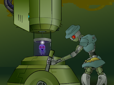
"Engineered" was thus made for a university assignment, and it was a first for me in many respects. It was the first five minute animation I ever made - the first animation where I had ever done such a quantity of work in less than half a year - the first time I shaded absolutely everything from beginning to end with gradients - and the first time I regularly drew characters and scenes from different angles instead of flatly reusing them from previous scenes. And even then it looks pretty flat to my eyes these days.
This Flash was also a breakthrough for me as it was the first time someone challenged me to do something well outside what I thought Flash was capable of and I was actually able to do it.
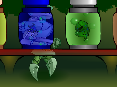
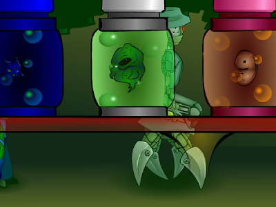
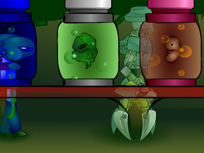
My Canadian friend Jay, a gentle giant of a man who deceptively looked like someone who beat up five year olds for fun, saw that I was working on a scene where the robot and the aliens walked behind liquid-filled glass jars preserving various alien foetuses.

"Hey, y'know what'd be cool? They should like, wrap around the jars as they go behind it. Like they warp and stretch through the glass as it refracts them."
I looked at him like he had an arm growing out of his neck.
"Jay, do you have any idea how long that would take? In any case I don't even think it's possible in Flash."
"Are you kidding, man? You can do anything in Flash, you're a fuckin' wizard! I bet you could come up with some clever way of doing it."
I nearly exploded. "Jay, don't do this to me, the film is due in like four weeks, and what you're suggesting can only be done with Frame By Frame. It would take ages, it'd look like shit and it would just be a waste of time. You can't do it with some special trick in Flash. The only thing I can even think of that might come close is if I were to go into the panning graphic, copy and paste the shape of the jars, use them as masks, mask out the robot and aliens... stretch an additional graphic from left to right... hang on, wait."
He laughed and went back to his own animation. When he came back to check up on me, I had beaten the challenge.


These stills don't really do it justice, but it became one of the most popular shots of the film, and everyone who saw it dropped their jaw with shock. It looked great, and I would never had done it if Jay hadn't made me.
Suddenly, I realised that Flash is nothing but problem solving.
There's nothing the program can't do. Only the animator.
This led to a veritable avalanche of future work that was a lot more dynamic than anything I had done previously, because I knew that I could handle any shot, no matter how complex, given enough time and patience. The challenge is figuring out how to do it.

From here on in, the one big thing that has improved with my animation is speed.

Did anyone see Ill Fate: Ep. 2?


This film contains many of my best shots ever and it also contains a lot of crap that was stretched to meet the deadline. That said, I think it's still a pretty big achievement to animate five and a half minutes of complete animation in as many days.

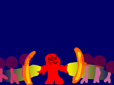
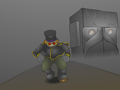
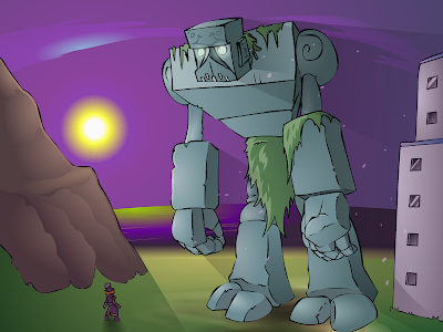
Lately I have discovered my big challenge is to mix it all with Frame By Frame. FBF is a lot harder (like, a LOT harder) and more time consuming (like, a LOT more time consuming) than tweening, but it looks more impressive, plain and simple. I have virtually made a career off tweening but I don't want to be known as the best tweener around, because that's like saying you are the best high-jump athlete at an aero club. There was a bit of pretty adventurous FBF in Ill Fate 2, particularly the Kaiser running up the Collossus' arm (top picture), but I endeavoured to include more FBF whenever I could from that point on. Usually, however, I still end up balancing the scales to tweens simply because of time restraints. If you can make them look good, then hey, you have just spent a tenth of the time and the effort. It just won't look as good.


These days I tend to go for a mix. For some reason, the marriage between tween dynamics and the raw beauty of frame by frame is totally underused. Well hey, all the more for me, because I think it's a quirky and pretty unique look. It's simultaneously taking advantages of the restraints of Flash and giving them the 'fuck you'.


THE POINT OF ALL THIS is that I didn't just wake up one morning able to use Flash. Same goes for drawing, I spent several years learning to do both.
If you want to make it sound hard and brutal, I have been using Flash for one decade and I have been drawing for two. Do the math.
Don't be disheartened if Flash is giving you the shits. Don't worry about your animation looking like it fell out of a tree.
It's all about practice, and that's all there is to it. The only difference between you and me is that I got a headstart.

Wednesday, October 7, 2009

Seth McFarlane is a pretty creative guy

Okay, so you guys might remember the Simpsons if you're old enough.

Sometime soon I'd like to do a post on the genius of early Simpsons (particularly ~ seasons 3 - 10) and its eventual decline, but for now let's talk about this guy called Seth McFarlane.

Seth McFarlane saw the Simpsons and thought they weren't wacky enough. So he made his own version of them after being fired by Matt Groening for taking too long with his coffee.

Thankfully, our good friend McFarlane managed to successfully raid the bins in the Writers' Room before being ejected from the studio. He took with him the comedy gold that was simply too off-the-wall for the Simpsons. He also took with him many of the precious first-drafts of such episodes, allowing him to make several suspiciously familiar plots that may remind us of the Simpsons, except these versions are untouched by snarling, uncreative executives and therefore funnier.

Somewhere down the line, Seth decided one episode of Family Guy where Peter Griffin starts off hating illegal immigrants and ends up accepting them upon seeing their culture just wasn't enough. He had to make another series so he could use that golden script twice, before it lost its flavour.


Quite possibly the wackiest white nuclear family to hit American screens since the Simpsons, or dare I say, the Griffins themselves, the Smiths (how original! McFarlane must have poured through the phonebooks for that one) are not just your average animated TV family. They're, um... American. Very American indeed.

Seeing as how he is a boundary pusher of the most dynamic variety, Seth McFarlane realised he needed something new. A whole new show to capture the hearts of viewers worldwide. It had to be something different; a new concept, new issues, a totally new platform for dealing with them.
And so he made history with quite possibly the bravest move in Animation History.

This time they're black. Whoah, there!!

Saturday, September 26, 2009

The evolution of anime


The Golden Age.


The Stone Age.


Today.